Karaté richard labonté
Design
Design
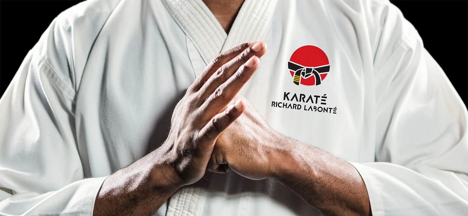
The Richard Labonté Karate School approached the Agency to overhaul their brand identity. The objective was to give the school a more human touch and to create a sense of belonging for students. One thing was crucial: to avoid using the clichés that so many other karate schools tend to use.
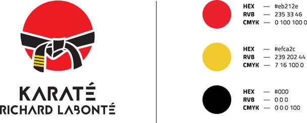
The agency created a simple and modern logo that effectively conveyed its message. The red circle represents Japan and the rising sun. The black belt features Sensei Richard Labonté’s four Dans. With the updated brand image came a new name: Karate Richard Labonté.