Paré Assurances
Design / Digital / Strategy
Design / Digital / Strategy
To celebrate their 60th anniversary, the Paré Brosseau management team started by modernizing their logo. The challenge was to revamp the logo while retaining certain important anchor points, like the lantern. We had to work with an established image and develop more representative branding for Paré Brosseau Assurances.
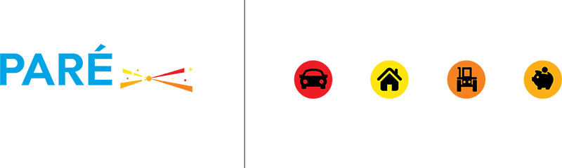
The Agency added four brightly coloured rays of light, each one representing one of their sectors of expertise. The lantern had been chosen as symbol for guidance and of how they shed light on their clients’ matters. In this way, it conveys the importance they place on their clients: the beams of light are there to light the way, to guide, to be useful, to see beyond. The colours are soft, but assertive. They are synonyms of trust, balance, loyalty and communication.