Dalisa Office Space
Design
Design

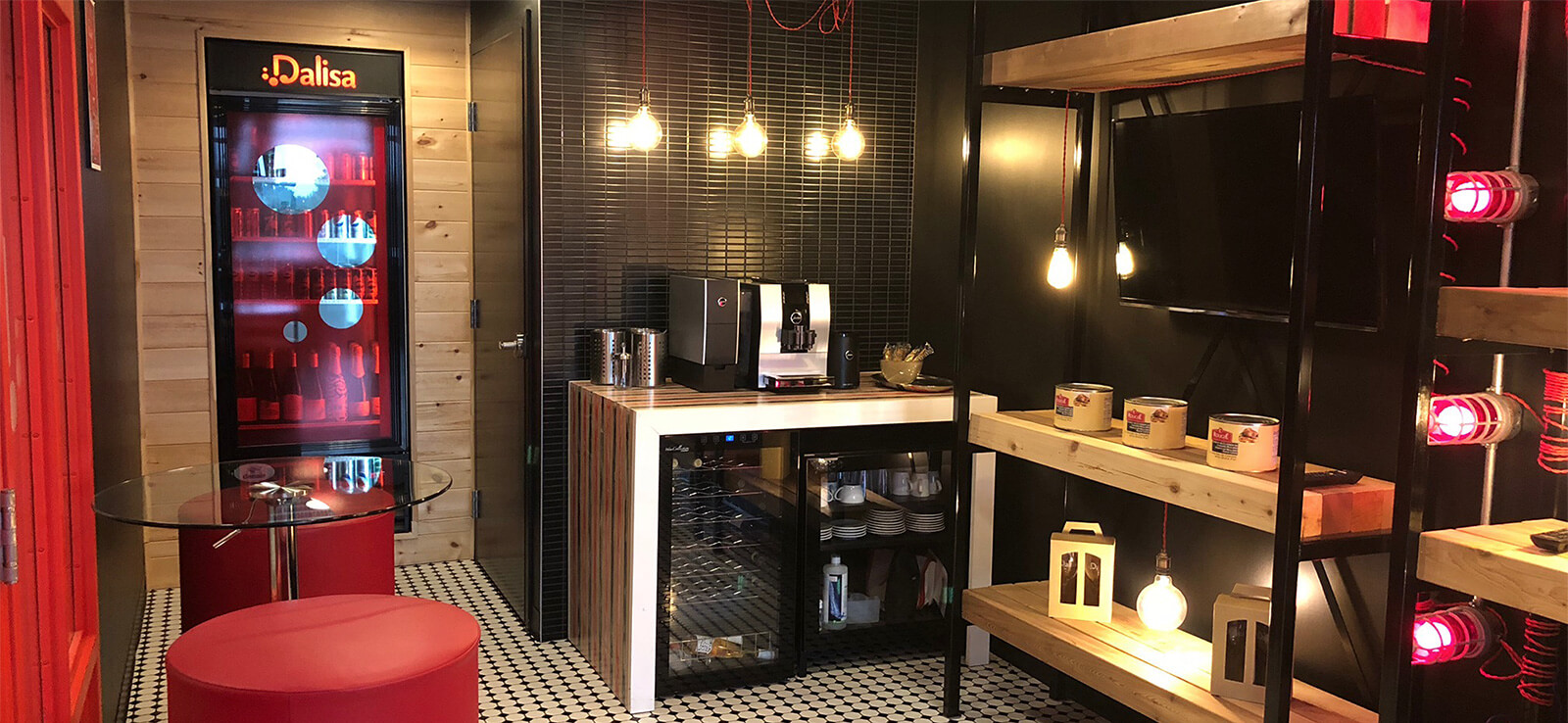
Since Bob Henry had already created Dalisa’s new logo and developed its strategic planning, it was mandated with developing the company’s new headquarters. As stated in its mission, Dalisa, The Gourmet Workshop wants to offer simple, unique and tasty culinary inspiration. The company promotes its values of health and innovation while committing to bringing the best taste experience to its customers. The challenge, then, is bringing Dalisa’s mission and new logo to life through the development of its office. Visitors must feel that they have been transported to another world as soon as they walk out of the elevator.

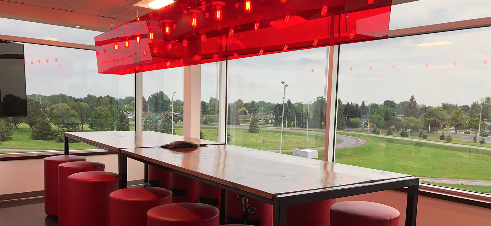
Bob Henry has therefore designed and developed the new headquarters. The colours and decoration are understated and distinguished. The materials used are those commonly found in a kitchen, namely metal and wood. The Dalisa experience is felt from the first step into the office. The reception is like a delicatessen or a small neighborhood café. The conference room is well suited for team meetings, consumer focus-group sessions and creative meetings for the research and development department. All the office furniture, from the reception to the laboratory kitchen, are exclusive creations designed for the needs of the client and the atmosphere sought by the company. All the work and furniture were produced jointly by Bob Henry and local artisans.