Maestro logo
Design
Design
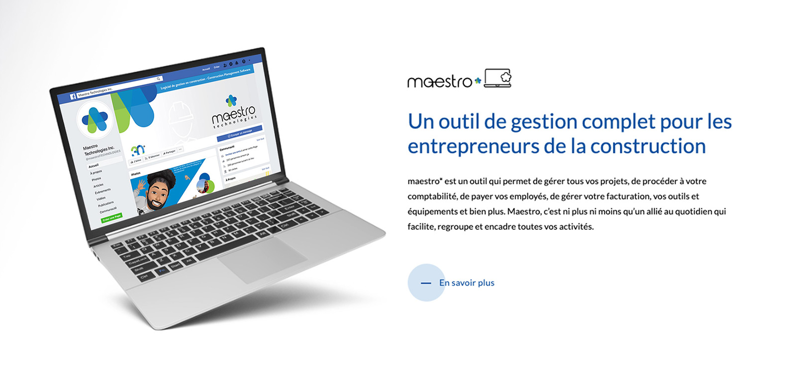
Keeping in mind the idea of using Silicon Valley companies as a reference point, we had to rethink the logo of the company which was celebrating 30 years and adapt it for web and paper use (business cards, folders, roll up, etc.). We wanted to give it a sleek, technological and contemporary look while inspiring confidence based on the company’s history.
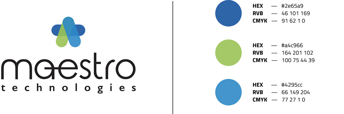
In giving new life to the company logo, we had to respect three important elements: roundness, the star and the signature. Since the star represents all facets and values of the company, we chose to highlight it in the logo and give it three colours that work together. We respected the curves of the company’s name, while still making the lines slightly thinner. The general shape of the logo is a triangle which points towards its star-shaped summit, like a customer seeking to achieve excellence in their field.