Dalisa lettering on trailers
Design
Design

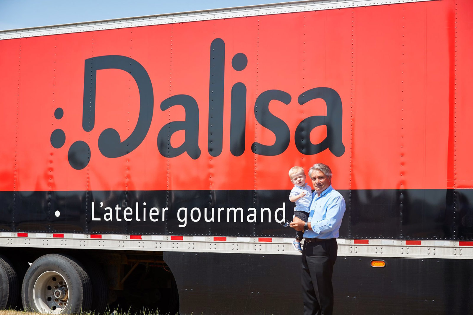
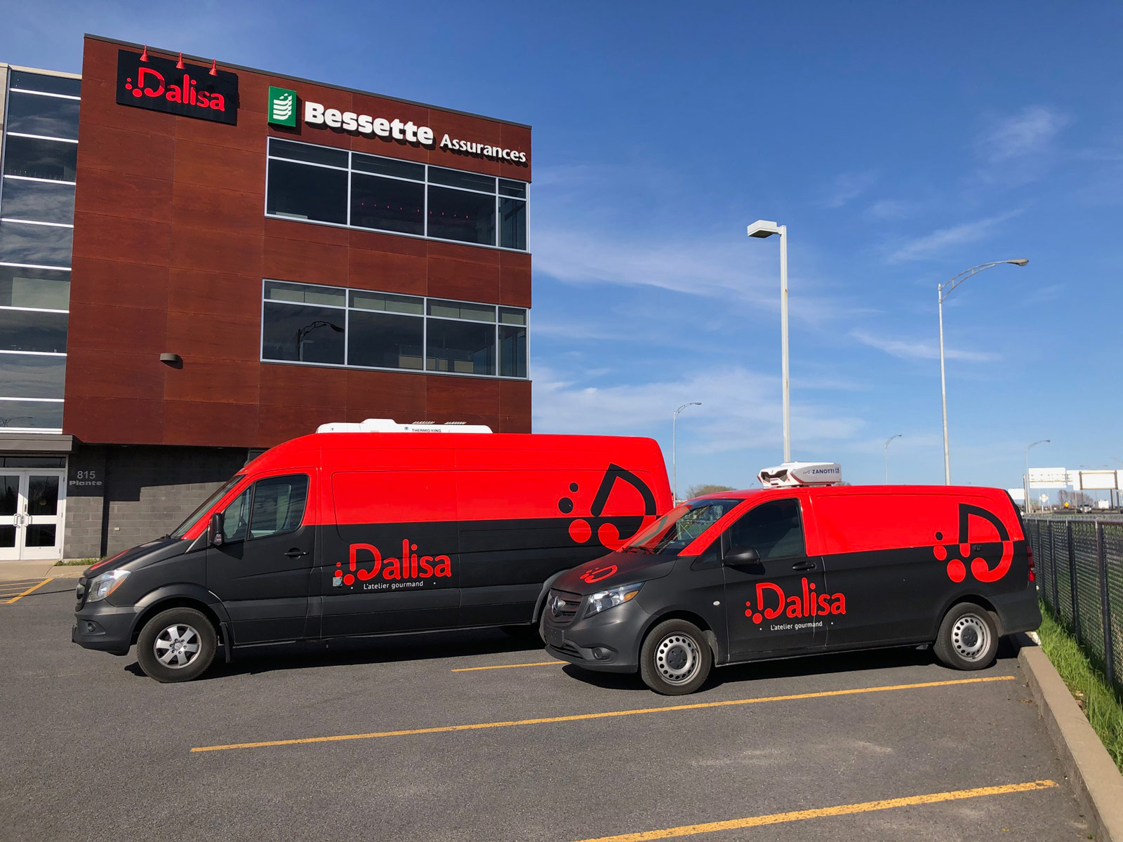
Redesigning Dalisa’s logo means the renewal of everything that supports this new branding, from the company’s stationery to the fleet of semi-trailers. If the company has trucks on the road, it’s important to have quality wraps on them for better visibility and to show off a style that is distinct and easy to recognize. From street trucks to small delivery trucks and semi-trailers, the Dalisa image is a combination of modern and sleek vintage. We wanted to leverage the company’s new colours, packaging and products to create a visual effect that is true-to-life.

In order to facilitate the consumer’s appropriation of Dalisa’s new visual identity, we wanted to keep all the key elements in the realization of the semi-trailers. The Agence proposed two simple and effective designs with common characteristics: black slate background, a round red logo and featured star products, with the website address visible to any driver. High-quality images and precise font are undeniable assets when it comes to getting a name, products and reputation to travel nationwide.
Dalisa Foodtruck / Dalisa Office Space / Joe Saucisse / Facebook / Lettering on trailers / New brand image / In-store tastings